Your cart is currently empty!
Designing with Edge: 20+ Best Square Fonts for Blocky Designs
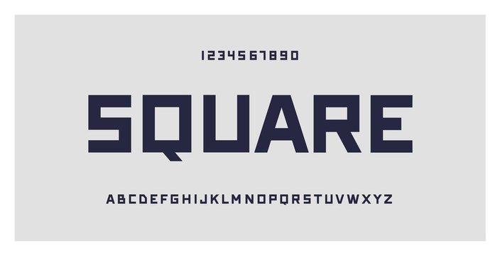
In the realm of visual communication, typography is not merely about selecting letters to form words; it’s about conveying emotions, attitudes, and narratives. Fonts have the power to shape perceptions, influence user interactions, and define brand identities. Among the diverse typographic styles, square fonts—also known as blocky or geometric fonts—hold a unique place. They evoke a sense of modernity, stability, and boldness, making them ideal for designs that aim to be both striking and functional.
As a proponent of human-centered design, I believe that the choice of typography should not only serve aesthetic purposes but also enhance usability and user experience. This article explores over 20 of the best square fonts suitable for blocky designs, delving into how they can be effectively utilized to create impactful and intuitive visual communications.
The Significance of Square Fonts in Design
Square fonts are characterized by their straight lines, sharp angles, and uniform proportions. They often convey:
- Modernity: Their geometric nature aligns with contemporary design trends.
- Strength and Stability: The solid structure suggests reliability and confidence.
- Clarity: Clean lines enhance readability, especially in digital formats.
- Minimalism: They support designs that favor simplicity and function over ornamentation.
When used thoughtfully, square fonts can enhance user engagement by making content more accessible and visually appealing.
Top Square Fonts for Blocky Designs
Below is a curated list of over 20 square fonts that can elevate your design projects. Each font is accompanied by insights into its unique characteristics and potential applications.
**1. Montserrat
Overview: Montserrat is a geometric sans-serif typeface inspired by urban signage and typography from the Montserrat neighborhood of Buenos Aires.
Characteristics:
- Clean and Modern: Straightforward letterforms with minimal stroke contrast.
- Versatile: Multiple weights and styles make it suitable for headings and body text.
Applications:
- Web Design: Enhances readability on screens.
- Branding: Conveys professionalism and modernity.
**2. Roboto
Overview: Developed by Google, Roboto features a dual nature with a mechanical skeleton and friendly curves.
Characteristics:
- Neutral Yet Approachable: Balances geometric shapes with open curves.
- Highly Legible: Optimized for readability across devices.
Applications:
- User Interfaces: Ideal for apps and digital platforms.
- Corporate Communications: Maintains clarity in formal documents.
**3. Eurostile
Overview: Designed by Aldo Novarese, Eurostile is a classic square font known for its futuristic feel.
Characteristics:
- Distinctive Square Shapes: Prominent in uppercase letters.
- Technical Appearance: Evokes technology and innovation.
Applications:
- Technology Brands: Aligns with high-tech aesthetics.
- Display Text: Effective for headlines and signage.
**4. DIN Next
Overview: Based on the German DIN standard typeface, DIN Next offers a clean and structured design.
Characteristics:
- Industrial Roots: Reflects engineering precision.
- Clear Geometry: Uniform stroke widths and minimal ornamentation.
Applications:
- Transportation Signage: Enhances readability from a distance.
- Technical Manuals: Supports clarity in instructional content.
**5. Neuzeit
Overview: Neuzeit is a sans-serif typeface that embodies simplicity and functionalism.
Characteristics:
- Minimalist Design: Strips down letters to basic geometric forms.
- Timeless Appeal: Combines classic and modern elements.
Applications:
- Editorial Design: Suitable for magazines and books.
- Corporate Branding: Conveys sophistication and reliability.
**6. Futura
Overview: Futura is a geometric sans-serif font designed by Paul Renner, emphasizing simple geometric shapes.
Characteristics:
- Pure Geometry: Circles, triangles, and squares form the basis of its letters.
- Elegant Simplicity: Lacks unnecessary embellishments.
Applications:
- Advertising: Grabs attention with its boldness.
- Packaging: Enhances product appeal with clean lines.
**7. Proxima Nova
Overview: Proxima Nova bridges the gap between typefaces like Futura and classic sans-serifs.
Characteristics:
- Hybrid Design: Merges geometric and humanist styles.
- Extensive Family: Offers a wide range of weights and widths.
Applications:
- Web Typography: Highly legible at various sizes.
- Brand Identity: Adaptable to different brand voices.
**8. Avenir
Overview: Created by Adrian Frutiger, Avenir is French for “future,” embodying a forward-looking aesthetic.
Characteristics:
- Harmonious Proportions: Balanced weight distribution.
- Friendly Geometry: Softer than strict geometric fonts.
Applications:
- User-Friendly Interfaces: Enhances approachability.
- Print Media: Works well in both headlines and body text.
**9. Square 721
Overview: Square 721 is a font that embraces the square aesthetic wholeheartedly.
Characteristics:
- Uniform Stroke Widths: Consistent lines throughout.
- Modern Industrial Feel: Suggests efficiency and functionality.
Applications:
- Architectural Firms: Reflects structural integrity.
- Technology Products: Aligns with modern gadgetry.
**10. Bank Gothic
Overview: A rectilinear geometric typeface designed in the 1930s, exuding a strong industrial vibe.
Characteristics:
- All Caps Design: No lowercase letters.
- Angular Forms: Sharp edges and straight lines.
Applications:
- Film Titles: Commonly used in science fiction genres.
- Logos: Makes a bold statement.
**11. Kanit
Overview: Kanit is a Thai and Latin typeface that merges modular forms with a touch of humanist warmth.
Characteristics:
- Geometric yet Friendly: Balances rigidity with subtle curves.
- Multilingual Support: Covers various scripts.
Applications:
- International Brands: Supports global communication.
- Digital Platforms: Enhances readability across languages.
**12. Exo
Overview: Exo is a contemporary geometric sans-serif font designed for both screen and print.
Characteristics:
- Futuristic Look: Sleek and modern appearance.
- Variety of Weights: From thin to heavy, offering design flexibility.
Applications:
- Tech Startups: Conveys innovation and progress.
- Gaming Industry: Fits well with digital entertainment themes.
**13. Rajdhani
Overview: Rajdhani is a squared, mono-linear font with a mechanical style.
Characteristics:
- Compressed Letterforms: Tall and narrow, saving horizontal space.
- Straight Edges: Minimal curvature enhances the blocky feel.
Applications:
- Urban Design: Suits metropolitan themes.
- Event Posters: Stands out in crowded visual environments.
**14. Orbitron
Overview: Orbitron is a geometric sans-serif font intended for display purposes.
Characteristics:
- Space-Age Aesthetic: Inspired by science fiction.
- Bold Letterforms: Thick strokes and high x-height.
Applications:
- Science Fiction Media: Ideal for futuristic designs.
- Technology Exhibitions: Captures attention with its boldness.
**15. Squada One
Overview: Squada One is a display font that merges boldness with geometric precision.
Characteristics:
- Strong Presence: Thick strokes make it stand out.
- Simplified Shapes: Minimalistic approach to letterforms.
Applications:
- Sports Branding: Conveys energy and strength.
- Headlines: Grabs attention in titles and banners.
**16. Press Start 2P
Overview: A pixelated font inspired by retro video games.
Characteristics:
- Blocky Pixels: Emulates low-resolution screens.
- Nostalgic Feel: Evokes memories of classic gaming.
Applications:
- Gaming Events: Perfect for retro-themed designs.
- Youth Marketing: Appeals to a younger demographic.
**17. Bebas Neue
Overview: Bebas Neue is a sans-serif font known for its clean lines and all-caps style.
Characteristics:
- Tall and Narrow: Maximizes impact in limited space.
- Elegant Simplicity: Unadorned letterforms.
Applications:
- Advertising: Effective for billboards and posters.
- Product Packaging: Enhances visibility on shelves.
**18. Saira
Overview: Saira is a sans-serif font with a wide range of weights and styles.
Characteristics:
- Geometric Foundation: Built on basic shapes.
- Versatility: Extensive family allows for cohesive typography systems.
Applications:
- Brand Systems: Maintains consistency across various materials.
- Editorial Content: Suitable for both headlines and body text.
**19. Righteous
Overview: Righteous is a display typeface with art deco influences.
Characteristics:
- Unique Curves: Combines straight lines with subtle curves.
- Decorative Elements: Adds flair without compromising readability.
Applications:
- Event Branding: Ideal for invitations and promotional materials.
- Cultural Projects: Fits themes that celebrate history and art.
**20. Asap
Overview: Asap is a contemporary sans-serif font designed for screen and print.
Characteristics:
- Moderate Contrast: Balances geometric shapes with slight humanist touches.
- Open Forms: Enhances legibility, especially at small sizes.
Applications:
- User Interfaces: Improves readability in app design.
- Educational Materials: Supports clarity in learning environments.
**21. Archivo
Overview: Archivo is a grotesque sans-serif typeface designed for high-performance typography.
Characteristics:
- Technical Aesthetic: Clean and efficient design.
- High Legibility: Clear at various sizes and resolutions.
Applications:
- Corporate Communications: Conveys professionalism.
- Transportation Signage: Ensures readability from a distance.
**22. Michroma
Overview: Michroma is a futuristic, techno-inspired font.
Characteristics:
- Extended Letterforms: Wide characters with uniform stroke widths.
- Minimalistic Details: Strips away unnecessary elements.
Applications:
- Music Industry: Fits electronic and techno genres.
- Product Design: Suitable for modern gadgets.
**23. Quantico
Overview: Quantico is a military-inspired typeface with angular letterforms.
Characteristics:
- Strong Angles: Sharp cuts and edges.
- Compact Design: Efficient use of space.
Applications:
- Security Firms: Conveys strength and reliability.
- Action Games: Enhances themes of adventure and excitement.
Integrating Square Fonts into Your Designs
When incorporating square fonts into your projects, consider the following human-centered design principles:
1. Prioritize Readability
- Contrast: Ensure sufficient contrast between text and background.
- Size Appropriately: Adjust font sizes for legibility across devices.
2. Maintain Hierarchy
- Use Varying Weights: Differentiate headings from body text.
- Consistent Styling: Apply styles uniformly to guide the reader.
3. Align with Brand Identity
- Reflect Brand Values: Choose fonts that embody the brand’s personality.
- Cultural Sensitivity: Be mindful of how fonts are perceived in different contexts.
4. Test Across Mediums
- Print and Digital: Ensure the font performs well in both environments.
- Responsive Design: Check how the font scales on different screen sizes.
Conclusion
Square fonts offer a unique blend of modernity, clarity, and strength, making them invaluable tools in a designer’s arsenal. By thoughtfully selecting and implementing these fonts, you can create designs that are not only visually striking but also user-friendly and aligned with human-centered design principles.
Remember that typography is a powerful form of communication. It’s not just about aesthetics; it’s about enhancing understanding, evoking emotions, and facilitating interactions. By keeping the user’s needs at the forefront, you can craft typographic designs that resonate and leave a lasting impact.
Embrace the geometric allure of square fonts, but let purpose guide your choices. When form and function harmonize, the result is a design that truly speaks to its audience.
Leave a Reply